
Data visualization is the representation of information and data in a graphical or pictorial format. It enables businesses to communicate complex ideas and data sets effectively, making it easier to understand, retain, and communicate information to a wider audience.
In today’s world, where people are inundated with information from multiple sources, data visualization has become an essential tool for content marketers to engage their audience and make a lasting impression.
But which is its role in Content Marketing and why is it essential you use them in your content pieces? Let’s roll.
Before we go on and explain the what & how, it’s first essential we get the why. Imagine traffic lights. You’re driving in your car, come near an intersection, and see the following sign.

On average, it takes people 12 seconds to read the above statement. Imagine the chaos and risk that would cause in that time. Now, take a look at the next sign.

The average driver reaction time is 0.75 seconds. Now, you know this sign means stop, without having to analyze it for eternity. This, in a nutshell, is exactly why we use data visualization in content marketing. Our brain constantly accumulates information from the environment and filters what is important. Through data visualization, we aim to immediately convey the main information to the reader as fast and concise as possible. Here’s how it works.
Data visualization makes it easier for people to understand complex data sets and ideas. It helps to clarify the relationships between data points, and to highlight patterns and trends that may not be immediately apparent from raw data.
Data visualization can help to engage your audience, making them more likely to pay attention to your message and to remember it. With interactive and visually appealing visualizations, you can grab the attention of your audience and keep them engaged.
Data visualization can help decision-makers to make informed decisions by presenting data in a way that is easy to understand and interpret. It can help to identify key trends, patterns, and insights that are relevant to decision-making, and to present this information in a clear and concise way.
Data visualization can help to improve communication by making it easier to share complex data sets and ideas with others. Whether you’re communicating with stakeholders, customers, or team members, data visualization can help to simplify and clarify your message.
Data visualization is a valuable tool for content marketers who are looking to improve their search engine rankings and attract more links to their content. Here are some ways that data visualization can help.
Data visualizations are often more visually appealing and memorable than plain text or tables. This makes them more likely to be shared on social media, increasing the visibility and reach of your content. The more shares your content gets, the more likely it is to be seen by a wider audience and to attract new links.
Data visualizations can help to make your content more engaging and interactive, improving the overall user experience. This is important for search engines like Google, which prioritize user experience when ranking content. By using data visualization, you can make your content more engaging, keep your audience on your page for longer, and improve your search engine rankings.
Data visualizations can help to create a more linkable asset. For example, if you create a unique and compelling visualization that is useful and relevant to your audience, others may want to link to it from their own websites. This can help to build your authority and improve your search engine rankings over time.
Data visualizations can also make your content look more trustworthy and authoritative. By presenting data in a clear and visually appealing way, you demonstrate that you have a good understanding of the topic and that you have taken the time to research and analyze the data. This can help to establish your credibility and make your content more appealing to other websites that are looking to link to authoritative sources.
By using data visualization, you can differentiate your content from plain text articles and make it more attractive to other websites that are looking to link to credible and informative content. This can increase the chances of your content getting picked up and linked to by others, boosting your search engine rankings and visibility.
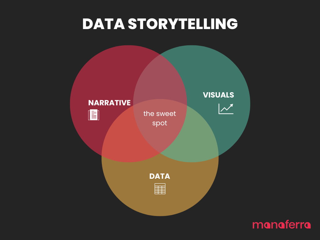
Data visualization and data storytelling are two very similar terms; still, they do have some notable differences.
Data Visualization refers to the process of creating visual representations of data to help make sense of the information. This can involve using graphs, charts, maps, or other types of visual elements to present data in a clear and concise manner. The main goal of data visualization is to help the audience understand and analyze the data.
Data Storytelling, on the other hand, goes beyond just presenting data. It involves taking data and turning it into a narrative that is engaging, memorable, and easy to understand. Data storytelling uses data visualization, but also incorporates other elements such as images, text, and multimedia to create a complete story. The main goal of data storytelling is to communicate the story behind the data in a way that is impactful and memorable.
In content marketing, you need both to make your case.
Data visualization can be a powerful tool for content marketing, but it’s important to use it effectively. Here are some best practices to follow:
If there’s something we want you to remember from this article, it’s this: Can a naive user understand what the visualization is trying to convey based only on the visualization itself? We can’t stress this enough. If you’re not able to convey the information immediately to the user and make them read additional information to understand it, you’ve lost them.
This is one of the most important practices. Choose the right type of visualization to suit the data you have and the story you want to tell. For example, if you want to compare data across categories, use a bar chart. If you want to track changes over time, use a line graph.
Use data visualization to tell a story. Use it to highlight important trends, patterns, or insights, and to make complex data sets easier to understand.
Avoid overcomplicating your data visualization. Keep it simple and easy to understand. Use clear labels, and choose colors that are easy on the eye.

Color is a powerful tool for grabbing attention and conveying information. Choose colors that are easy to distinguish, and use color to highlight important data points or trends. Always remember to use colors that match the brand.
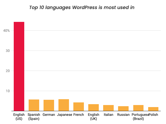
Let’s take as an example the Top 10 languages WordPress is most used in. Considering the dataset, this is best represented through a bar chart.

This is a bad example on how to visualize a bar chart. There are many colors, and the user doesn’t know where to focus. Let’s fix it.

Here, we can immediately notice that English is way more popular than other languages, and that’s the information we want to convey. That’s why we used a different color to highlight it. The other languages, however, do not have different colors. Instead, they’re represented with the same one.
Another common mistake many people make when visualizing data is using wrong colors in maps.

The above map visualizes the top states for plastics employment, and uses different colors to highlight different states. This, more often than not, will confuse the user. There are many colors used, sometimes red means lower than green, and the reader just doesn’t know where to focus. Let’s fix this.
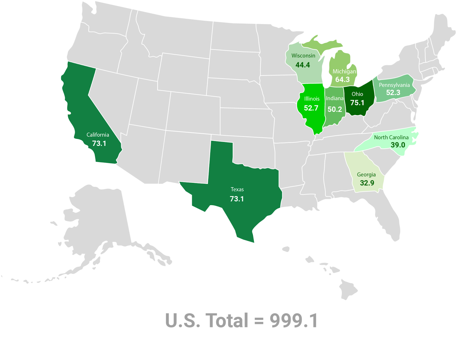
Notice how the colors are ranked from colder to hotter. The darker the green, the higher the employment number.
Label your data visualization clearly and accurately. Use clear, concise labels that explain what each data point represents. You don’t want to have a dataset that tells one thing and a data visualization that tells another.
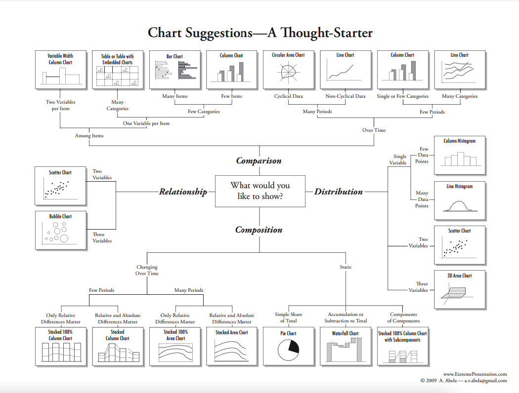
As previously mentioned, choosing the right data visualization is critical for conveying the correct information to your audience. But with tens of different visualization types, how do you choose the right one? Trust us, it’s not rocket science. The trick is to answer these four main questions.
Let’s go through each one of them.
Do you want to show a simple statistic of which country had the highest air pollution level last year? Or do you want to convey a more complex message that shows correlation between different variables and might want to motivate your audience to take action?
Let’s take the first example. We want to show which countries had the highest deaths due to air pollution in the world and rank them from highest to lowest. This dataset was randomly chosen from Kaggle.
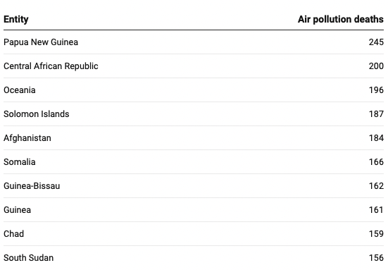
This dataset is shown as a table. In one column, we have a categorical variable (Country) and in the other a quantitative variable (Deaths). The categories are sorted by number of deaths rather than alphabetically by genre. This makes it easy to glance at the table and get an idea of which countries had the highest number of deaths.
Adding to this, the table takes up relatively little space. If the purpose of the data visualization is to communicate simple information about the number of air pollution deaths in specific countries, this table is a good choice. But what if the information is more complex?
Next, we have a table created with the same dataset but showing slightly different information. Instead of total air pollution deaths, this table presents the deaths for two different scenarios: indoor air pollution deaths and outdoor air pollution deaths.

Comparing air pollution deaths between several countries was very straightforward. However, comparing different forms of air pollution deaths between said countries is a bit more complicated. As a result, our message isn’t communicated effectively.
By changing the type of data visualization here, we can effectively communicate more information. The following displays the same data and the table previously used, but in the form of a grouped column chart.
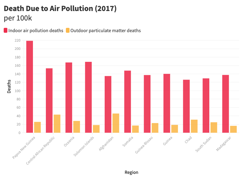
Now, it’s evident that the majority of air pollution deaths are caused by indoor air pollution rather than outdoor particulate matter.
When it comes to their purpose, data visualization can serve for various purposes. We can sum the up in four:
Example: Comparing the sales of two different drinks in the same restaurant
Example: Showing the breakdown of a kindergartener’s favorite fairy tales
Example: The number of Covid-19 deaths in each state
Example: Showing how higher salaries are correlated to better employee performance
There are several types of data visualization techniques, each with its own strengths and weaknesses. When choosing a data visualization method, consider the type of data you have, the story you want to tell, and the audience you are trying to reach.
When it comes to their purpose, data visualization can serve for various purposes. We can sum the up in four:
Example: Comparing the sales of two different drinks in the same restaurant
Example: Showing the breakdown of a kindergartener’s favorite fairy tales
Example: The number of Covid-19 deaths in each state
Example: Showing how higher salaries are correlated to better employee performance
The bar chart is best used when comparing individual data points. When you only have 2 data
points, then you may use 2 different colors for each bar. However, when several data points are to be shown, then it is best to use a single color for all bars, and only highlight one (when needed with a different color).
So in general:
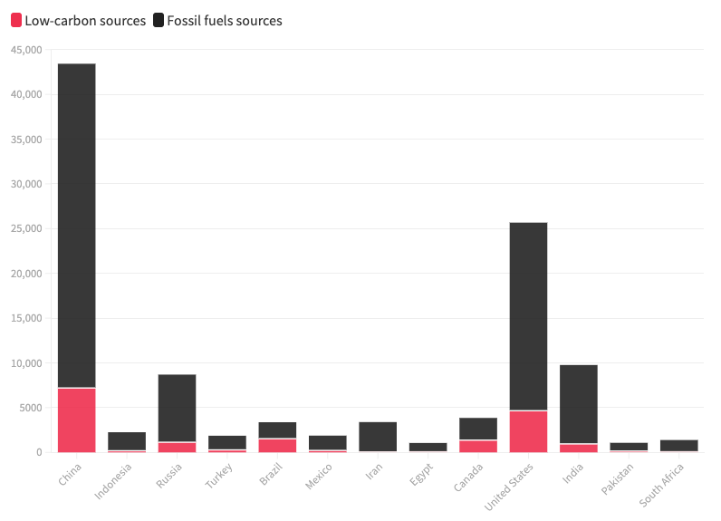
Column charts are used to compare values across different categories or groups. The height of the columns represents the size of each category, making it easy to identify which category is the largest or smallest. Column charts are particularly useful for displaying data that changes over time or for comparing data across different categories.
Some tips for creating effective column charts include:
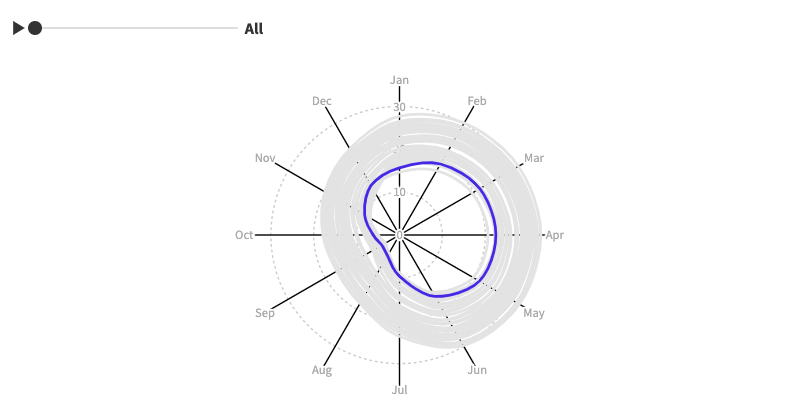
Circular area charts, also known as polar area charts or rose charts, are used to display data in a circular format. They are particularly useful for displaying data that has a cyclical or radial pattern, such as wind direction or radiation intensity. Circular area charts are similar to pie charts, but instead of using slices, they use sectors of different sizes to represent the data.
Here are some best practices for creating effective circular area charts:
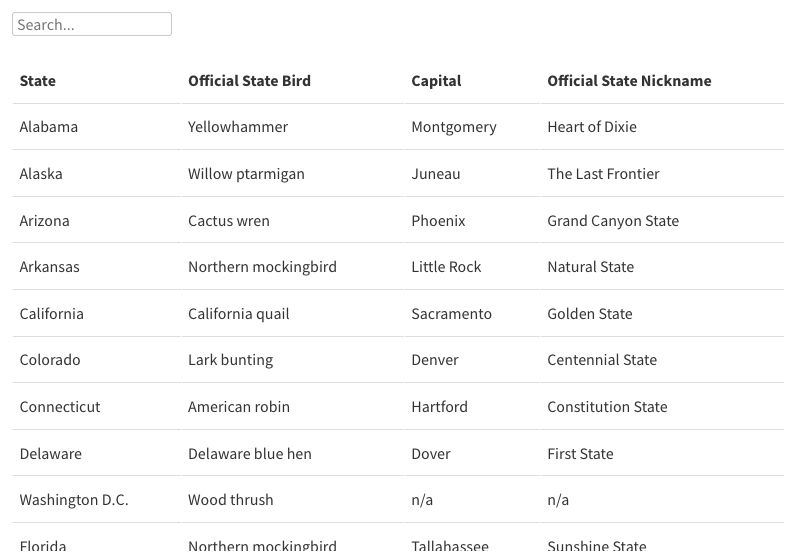
Tables are an effective way to present data in a structured format, making it easy to compare different data points. Tables are particularly useful for displaying large amounts of data that can be sorted and filtered, such as financial data or demographic information.
Here are some best practices for creating effective tables:
Line charts, by contrast, are primarily used to only show one data-set over time. So when you are trying to show how something has changed over time (an increase or decrease of sorts), this type of graph usually does the trick. Now, you may still use this when comparing several data sources, but usually, anything more than 3-5 lines will be overwhelming.
A couple of points here:
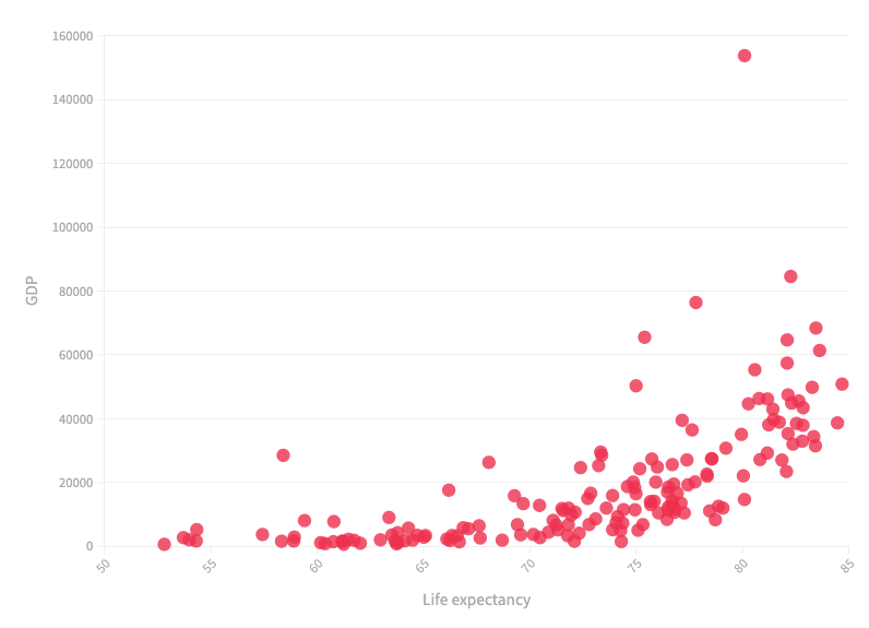
Scatter charts, also known as scatter plots, are used to display the relationship between two variables. They are particularly useful for identifying trends or patterns in data that may not be immediately apparent. Scatter charts use a series of points that are plotted along the x and y axes, with each point representing a unique data point.
Here are some best practices for creating effective scatter charts:

Bubble charts are a variation of the scatter chart that adds a third dimension to the data. The size of each bubble represents the value of a third variable, in addition to the x and y variables. Bubble charts are particularly useful for displaying data that has multiple dimensions or for comparing data across different categories.
Here are some best practices for creating effective bubble charts:
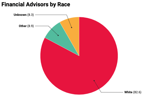
This one is super common, and I’d expect you’ll need to use one of these very often in your work. Pie charts are used when comparing percentages of the same source. The cool thing about them is that they can easily be stylized: whether in 2d colors, or fully 3d and interactive.
Points to follow:

Waterfall charts are commonly used to illustrate how an initial value is affected by a series of positive or negative values. It is particularly useful when trying to show the contribution of different factors to a total value.
Some tips to follow:
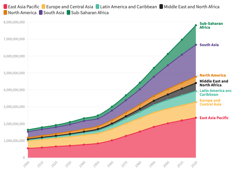
Stacked area charts are used to show how different categories contribute to the total value of a dataset over time. They are useful when trying to show trends and patterns in data over a specific period.
Some key points to remember:
Stacked column charts are similar to stacked area charts but instead of using an area to represent the data, they use columns. They are useful when trying to show how different categories contribute to a total value.
Some tips to follow:
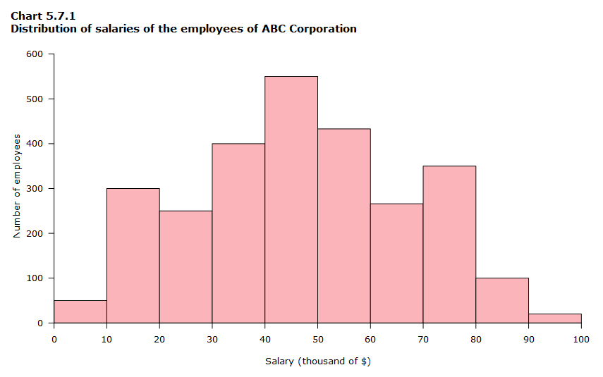
Column histograms are used to show the distribution of a continuous variable. They are particularly useful when trying to identify the most common values in a dataset.
Some key points to remember:

Line histograms are similar to column histograms but instead of using columns, they use lines to connect the frequency of each value. They are useful when trying to show the distribution of a continuous variable.
Some tips to follow:
3D area charts are used to show how different categories contribute to the total value of a dataset over time, with the added dimension of depth. They are useful when trying to show trends and patterns in data over a specific period.
Some tips to follow:
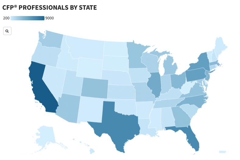
Maps are a powerful tool for visualizing data on a geographical scale. They can help to show the distribution of data across a region, and can highlight patterns and trends in data that are specific to a particular location.
Always keep in mind to:
There are several tools available for data visualization, ranging from simple online tools to complex data analysis platforms. Here are some of the most popular and easy-to-use tools for data visualization:
Flourish is a web-based platform for creating interactive data visualizations and storytelling. It provides a user-friendly interface and a variety of templates and customization options for creating engaging and informative graphics. With Flourish, users can import data from a variety of sources and transform it into visually appealing and interactive visualizations, including charts, maps, and animations. Datawrapper
Similar to Flourish, Datawrapper is a data visualization tool designed for creating clear and effective data-driven graphics for content marketing. It is a cloud-based platform that allows users to upload data and choose from a range of customizable chart types to create visually appealing graphics. The platform provides a user-friendly interface and a range of templates, making it accessible for users with little to no prior design experience.
Datawrapper also offers a variety of customization options, allowing users to modify the design and appearance of their visualizations to match their brand’s style and aesthetic. In addition, Datawrapper provides a simple and secure way to embed the visualizations into websites and presentations, making it a valuable tool for content marketers looking to communicate complex data and insights to their target audience in a clear and engaging way.
While not as straightforward as Flourish and Datawrapper, HTML can be used for data visualization by creating dynamic and interactive graphics using a combination of HTML, CSS, and JavaScript. These visualizations can be created using various libraries and frameworks, such as D3.js, Chart.js, or Highcharts.
These libraries provide a set of pre-built functionalities that allow developers to create custom visualizations based on specific data sets, such as bar charts, line graphs, pie charts, and more. By leveraging HTML, content marketers can create dynamic and interactive visualizations that can be easily embedded into web pages, making it a valuable tool for effectively communicating complex data and insights to their target audience.
Additionally, HTML visualizations can be optimized for mobile and other devices, providing a responsive and accessible way to engage with data on the web.
As an award-winning SEO agency, we understand the importance of Data Visualization in SEO and link building. Over the years, we’ve manually built thousands of high-quality links for our clients through personalized data-driven content. Here are some of our examples that have taken coverage in some of the most famous sites.
Like what you’re seeing? Schedule a free consultation and let’s grow your brand!

Content & Outreach, Partner
Roni is the Head of Content & Outreach at Manaferra and the team’s guide to understanding and creating and promoting linkable content.
Roni is the Head of Content & Outreach at Manaferra and the team’s guide to understanding and creating and promoting linkable content.
Stay up to date with the latest marketing, sales, and service tips and news.